12 Common Architecture Website Mistakes to Avoid
Have you ever felt like your architecture firm’s website isn’t pulling its weight in attracting clients?
You’re not alone.
Many architects sense that their online presence is lacking but aren’t sure where to begin making improvements.
Your firm's website is one of your most important marketing tools, and small mistakes can add up to lost opportunities and clients.
A well-designed website not only showcases your firm's architectural and design talents but also engages potential clients and sets you apart from the competition.
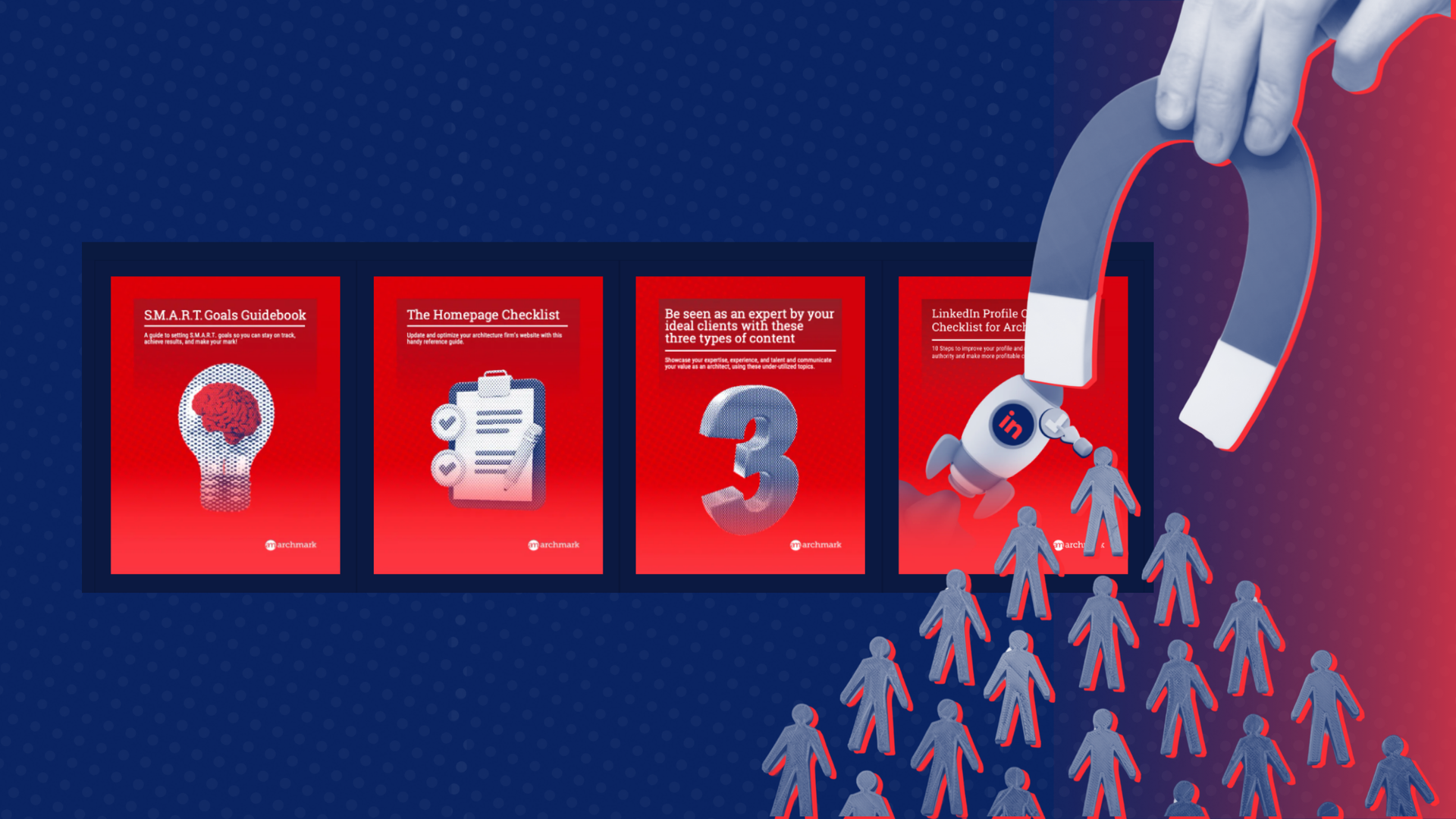
Since 2016, Archmark has tested more than 750 architecture firm websites. In that time we have identified the 12 most common mistakes that firms are making online. These mistakes result in lost opportunities for firms.
Keep reading to learn how to ensure your site effectively communicates your expertise and captures the attention of your target audience.
Why Your Architecture Firm Website Really Matters
Let's be real. Today, in 2024, everyone is online.
We learn online, shop online, we find our mates online. We do it all online.
And for that reason your website is often the first impression your potential clients will have of your firm.
If it doesn't capture their attention, if it doesn't help your firm stand out from others, and if it doesn't make it ridiculously easy for potential clients to learn about you and your work, then you are running the very real risk of losing their attention.
A website is about more than just aesthetics. Your site's SEO and user experience impact how many visitors get to your website from search engines.
And if the site they land on doesn't work or do it's job as a marketing tool, those visitors aren't likely to move on. In fact, nearly 88% of online consumers are less likely to return to a site after a negative experience.
In our own testing, there are 12 architecture firm website mistakes that can cost you valuable leads and project inquiries:
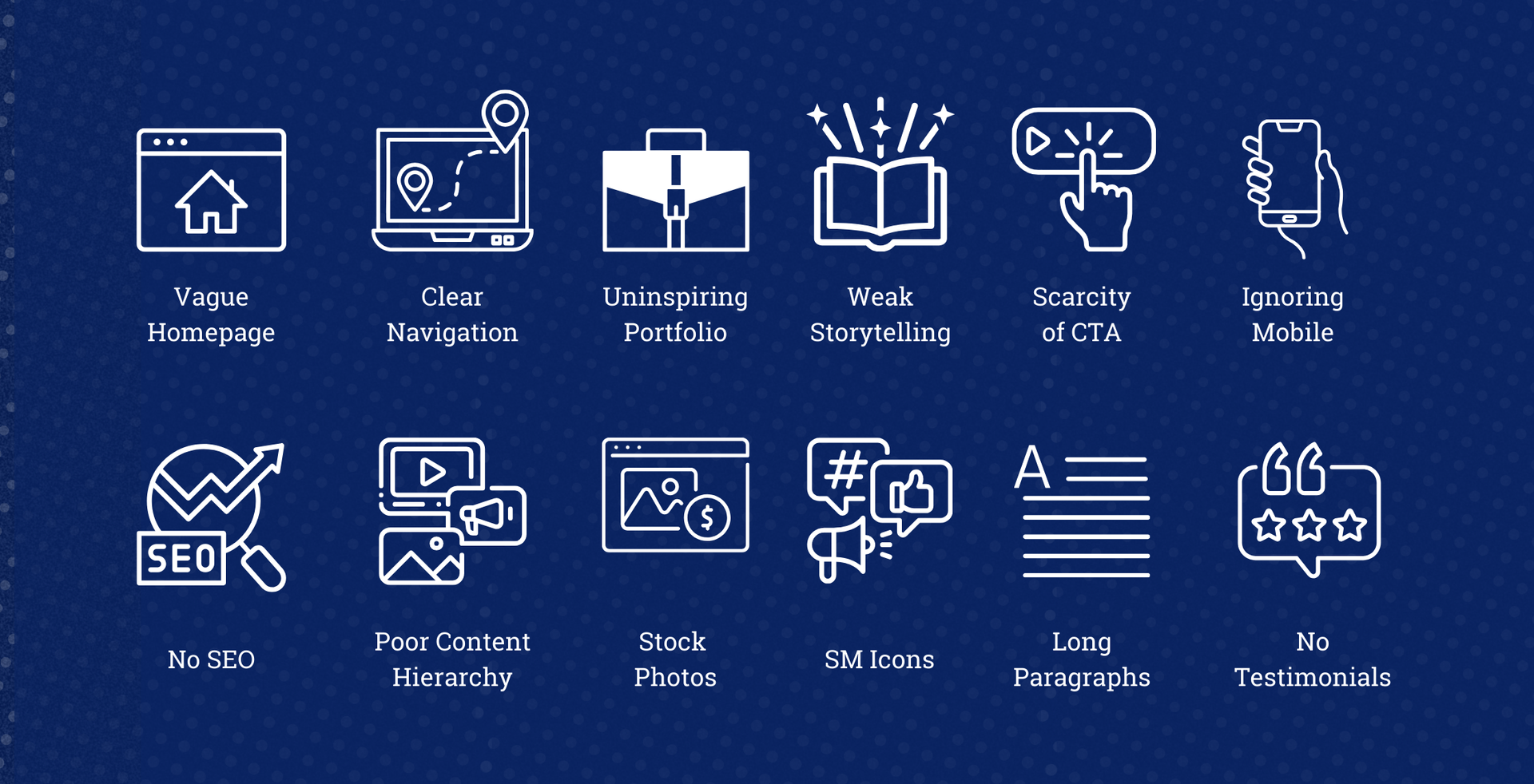
12 Common Mistakes Architects Make On Their Websites
Through our experience working with countless architects over the years, we've noticed a pattern of recurring errors. These common mistakes may seem subtle, but they can be quite damaging.
Here's a breakdown of common architecture website mistakes that you should avoid making.
Mistake 1: The Curse of the Vague Homepage
Too many architects fall into the trap of using a stunning image slider on their homepage with minimal text. While visually appealing, this approach fails to capture the visitor's attention.
It takes about 50 milliseconds (0.05 seconds) for users to form an opinion about your website that determines whether they’ll stay or leave .
They need to know who you are, what you do, and why they should care—instantly.
Your homepage headline needs to be clear and compelling.
Instead of a generic "Welcome" or a rotating image carousel, use strong, concise messaging that conveys the essence of your firm's expertise.
For example, if you specialize in residential architecture, you might say, "Crafting Sustainable and Inspiring Spaces for Modern Living" or "Designing Homes that Enhance Lifestyles."
Additionally, make sure your images are optimized for fast loading to prevent visitors from leaving before the site even loads.
Mistake 2: Neglecting the Power of Clear Navigation
Have you ever landed on a website with confusing navigation menus that resemble a labyrinth? This is one of the most frustrating website design mistakes - that most often leads to lost leads.
Confusing navigation can be a dealbreaker. Research at Stanford University shows that 94% of website first impressions are design-related, and a big part of that is how easy your site is to navigate. If visitors can’t find what they’re looking for quickly, they’ll likely leave your site.
Keep navigation straightforward with clear labels like "Projects," "About," "Process," and "Contact."
Avoid using clever or ambiguous terms, such as "Folio" instead of "Portfolio," or creative terms like "Thoughts" instead of "Blog." Clear navigation helps visitors quickly and easily find what they're looking for without confusion and frustration.
Mistake 3: Uninspiring Project Portfolios
Your portfolio is the heart of your architecture website. However, architects often stuff it with too many projects and too many images. This can cause to slow loading times and discourage visitors from waiting around.
And, when the portfolio lacks a clear focus or narrative, it becomes a blur of images that blend together with no meaning.
Curate your projects and images thoughtfully. Select the work and images that highlight your range of skills and best emphasize your firm's focus and strengths.
Instead of presenting a laundry list of projects, consider thematic or project type-based categories to organize your portfolio. Include detailed project descriptions, high-quality images, and even client testimonials to make your work stand out.
Showcase your design process, highlight the unique challenges of each project, and the innovative solutions your firm provided.
Mistake 4: Weak Storytelling
Architecture is more than just design concepts, construction documents, and structures—it's about transforming people's lives through design. Inject personality and authenticity by incorporating your firm's story, design philosophy, and values.
Share client testimonials, highlight awards or recognitions, and showcase the human side of your firm.
Storytelling is also a powerful tool to engage your website visitors.
Data from OneSpot reveals that 92% of consumers want brands to make marketing that feels like a story. Integrating storytelling into your website by sharing your firm’s journey and project success stories can create a stronger connection with your audience.
Clients connect with firms that share their values. Tell stories about your projects that resonate with your ideal future clients. For example, if you specialize in sustainable architecture, highlight how your designs have helped clients reduce their carbon footprint.
Mistake 5: A Scarcity of Calls to Action
Don't leave potential clients hanging. Once you've captivated their attention with stunning visuals and engaging content, gently nudge them toward taking action.
Include clear and compelling calls to action throughout your website, such as "Schedule a Consultation," "Explore Our Portfolio," or "Download Our Brochure."
Make it incredibly simple for them to take the next step.
Remember, the easier you make it for prospects to connect, the more likely they are to convert into clients. Add a contact form to every page so it's easy for people to get in touch. You could also use a chatbot to answer common questions.

Mistake 6: Ignoring the User Experience on Mobile
Mobile responsiveness is crucial! With more than 50% of all website traffic coming from mobile devices, how your website works and looks on a mobile device will create a first impression that can win or lose a prospect.
A mobile-friendly design is essential to prevent potential clients from leaving your site, and never coming back. Google has found that 61% of users are unlikely to return to a mobile site they had trouble accessing.
Because a significant portion of your website traffic will come from mobile, you want to provide a seamless experience on all devices. Start by simply viewing your website on different screen sizes to check for any display issues, problems with navigation, or missing information.
This also includes making sure that your font sizes are large enough to read on a small screen, and that the buttons are easy to tap.
Mistake 7: No Search Engine Optimization Strategy
Crafting a visually stunning website is futile if it's buried in search results. We see this all the time.
You really must invest in proper search engine optimization (SEO) for your website.
Identify relevant keywords related to your practice and location. Naturally weave those keywords into your content to enhance your website’s chances of ranking high in search results.
This includes using alt text for all of your images, optimizing your website's title tags and meta descriptions, and building backlinks to your site.
Improving your site's SEO will help attract more of the best-fit clients.
Looking for more SEO tips for architects? Check out our blog with
5 tips to improve your website’s SEO!
Mistake 8: Poor Content Hierarchy
Many architecture websites suffer from a lack of content hierarchy, making it difficult for visitors to quickly find relevant information.
It's essential to organize your content in a way that guides visitors through your site intuitively. Use headings, subheadings, and sections to break up text and highlight important information.
Structure your content hierarchically, with the most critical information at the top. This approach helps users scan the page and locate what they're interested in, whether it's your portfolio, team information, or contact details.
Mistake 9: Overuse of Stock Photos
Stock photos can make your website look generic and insincere. While they can be useful in limited contexts, avoid using them to represent your team or projects.
Authenticity is key.
A survey by Stackla found that 86% of consumers say authenticity is important when deciding which brands they like and support. Using real images of your team and projects can create a more genuine connection with your audience.
If stock photos are necessary, ensure they are used in contexts where it's clear they are representative and not misleading.
Mistake 10: Misplaced Social Media Icons
Social media icons are often placed prominently on architecture websites, but this can inadvertently direct traffic away from your site.
Instead of positioning them at the top, consider placing them in the footer. This allows users to explore
your social media presence without leaving your website before they've even started learning about you.
Mistake 11: Long Paragraphs
Web users tend to scan rather than read in detail.
Long paragraphs can be daunting and may deter readers from engaging with your content.
Break down your text into shorter, digestible sections. Use bullet points, numbered lists, and concise sentences to convey information effectively.
This approach caters to the scanning behavior of online users and ensures your message is communicated clearly.
Mistake 12: Underutilizing Testimonials
Instead of relegating testimonials to a single page, incorporate them throughout your website to build credibility and get more eyes on the words of your happy clients.
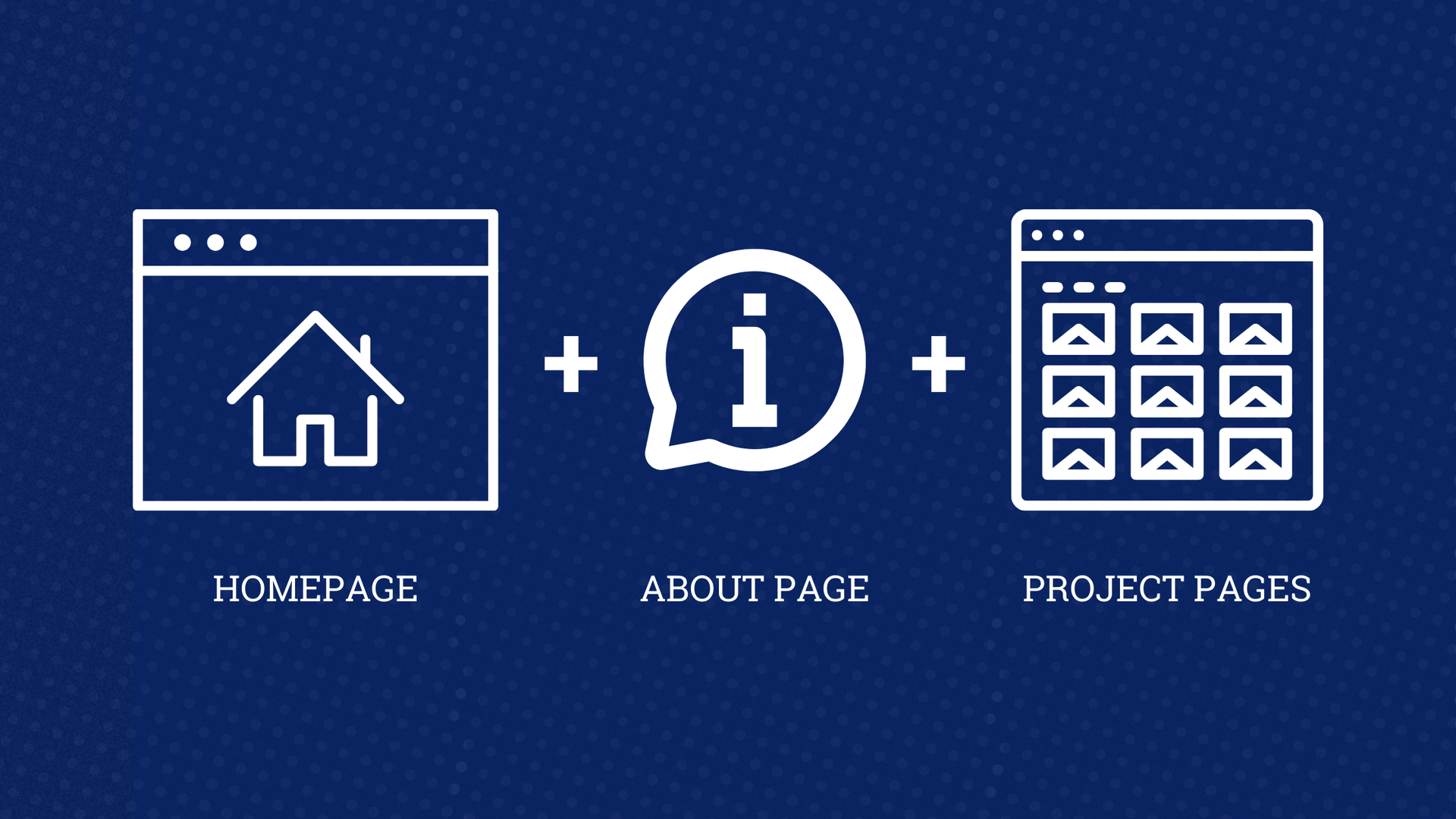
Use short, impactful quotes from clients on pages like your homepage, about page, and specific project pages.
Gathering testimonials through feedback meetings with clients can provide authentic insights into their experience, which you can then use in your marketing materials.
Make Your Architecture Website a Client-Winning Machine
Your architecture website is more than just an online portfolio—it's a powerful tool that can help you win clients, elevate your firm's brand, and attract top talent.
Avoiding these architecture website mistakes can be the deciding factor in securing lucrative projects, forging meaningful client relationships, and standing out in today's saturated digital space.
Your website should reflect your design talents and expertise so you can drive business growth.
Ready to take your architecture website to the next level? Archmark specializes in helping architecture firms create compelling online experiences that attract clients and showcase your expertise.
Contact us today to find out how we can help you transform your website into a client-winning machine.