I can hear you already, “Wait, what do you mean my website’s not about my firm?” Don’t worry, it is, but at the same time, it must connect with your ideal prospect. Too often, we see architecture firm websites that are more about “show and sell” than about “building relationships.”
Of course, your website should promote your architecture firm and represent what you do. BUT, to attract and engage visitors, your website needs to answer prospective clients’ questions and concerns about working with your firm.
The best way to do this is to look for ways to tailor your website to the needs of your ideal target clients. This makes it more likely they will be interested in your website’s content and information, and more likely to take the next step toward engaging with your firm.
Start with your homepage!
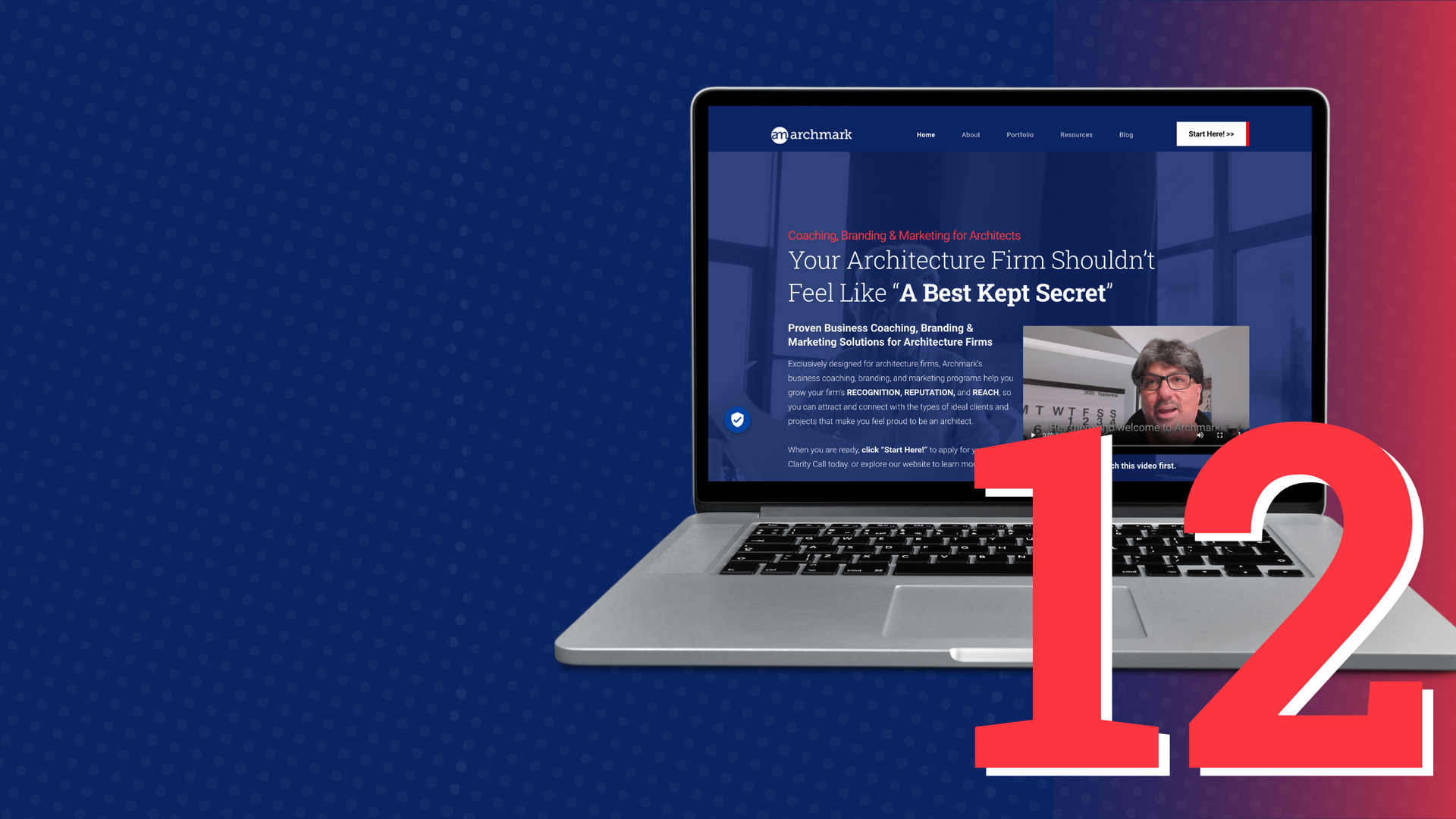
Your homepage plays a critical role in this process. When someone visits your site for the first time,
you have 5-8 seconds to grab their attention and convince them that they are in the right place.
When we evaluate websites, we look to see if the homepage passes “The Grunt Test.” In other words, does the website quickly answer three basic questions that visitors need to know at a glance:
- What your firm does best?
- Why should the visitor care?
- What is the next step?
If your website does not answer these important questions at first glance, most visitors will leave your site, for good. A great way to evaluate the effectiveness of your homepage is to review your analytics reports. If you are seeing high bounce and exit rates on your homepage, then it likely needs some work.
Designing A Client-Centered Website
Writing your site’s content to answer your prospective clients questions is the best way to attract and engage your potential clients. However, the designing a client-centered website is vital to creating a great experience. Keep in mind that your clients are likely not designers themselves. They are busy people who appreciate simplicity and ease of use. When designing your site, keep these best practices in mind:
- Use plain, clear language in your sites navigation, for example, Home, About, Case Studies, Blog, avoid obscure or confusing terms.
- Make your site dead simple to use. Don’t hide the menu or force visitors to click unnecessarily to get to vital information.
- Avoid excessive animation or anything that might annoy or disrupt your users’ ability to use your site or find information.
- Make it obvious to visitors how they can contact your firm. Include your phone number and a contact us tab on every page.
- Make sure your site is optimized to load within 2-3 seconds and that images are properly compressed to look good and load fast.
Remember, you are not designing a website to impress your architecture colleagues, you are designing a site that helps potential clients understand your firm. If your site is difficult or frustrating to use, a potential client is going to subconsciously assume that your firm is difficult or frustrating to work with.